 A good story can give momentum to a vision or idea.One of the ways a story can do that is by making connections, and drawing relationships, between different events.To feel connected, to belong, are basic human needs.Maybe that’s why we perk up when new connections, our relationships to others, are revealed to us in a story?
There’s many ways to tell a story
A good photo tells a story.Look at Vanity Fair’s compilation of the 25 best news photos.Each photo speaks of something more than just an image.From each photo, we create our own story (in a thousand words or less!) and motivations.
A good video is another powerful medium for storytelling.I’ve written about the Kiva story.It’s an excellent example of a video story that speaks of our connectedness, and uses that connectedness to motivate us to action e.g., to share our wealth.
Of course, text and audio formats are available for storytelling.
And then there’s the data visualization way
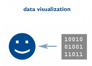
Data visualization is an expressive medium. It’s another way we can tell stories that help us make sense of the world.The idea of data visualization has been around a long time (see Milestones in the History of Data Visualization).For five hundred years we wrote and illustrated those stories for the printed page.Today, digital technology affords us some new, creative opportunities for data visualization and storytelling.
Some of the new areas of focus for data visualization include:
- Graphics e.g., Project Descry
- Motion graphics one of the best examples is Hans Rosling’s brilliant TED presentation
- Interactive e.g., Dipity’s interactive timelines
Data visualization is a topic au courant:
- It’s collaborative potential is a focal point of IBM Research
- It’s in the traditional news media, such as this recent NY Times article featuring data visualization of the current recession
- It’s recognized in academia; e.g., as in Harvard Visualization course
- It’s the domain of well known bloggers; as in this recent Beth Kanter post
Nancy White’s visual thinking bookmarks on Delicious is a solid reference for further exploring data visualization.
What interesting ways are you using data visualization to make important connections, and communicate your story?
If you enjoyed this post, please consider leaving a comment or subscribing to the feed to have future articles delivered to your feed reader.
Photo credit cambodia4kidsorg

Speak Your Mind